Introduction
In this article, we'll make:

In Tailwind Tidbits, I'm going to pick designs from all around the web and show you how to make them with TailwindCSS. For the most part, I'll be finding these designs from sites like dribble and Behance, but I'd love to do suggestions from comments as well!
For part 1, we'll be building a standard profile card with a neumorphic style. This is a style that is near and dear to my heart because I've always found it fascinating, and my own personal site is built in this style. I have also built the exact profile card we'll be building today in SCSS (and it even has a light/dark theme toggle built in), which you can find in this CodePen.
This tidbit will assume that you have gone through the process of getting TailwindCSS up and running on your machine. If you haven't, check out my guide: TailwindCSS: The Very Basics (Installation + IntelliSense).
With all Tailwind Tidbit guides, we'll be starting from the final result of that guide. If you haven't gone through the guide but want to go through this Tidbit, simply clone the repo, run yarn install then yarn build, and you'll be ready to go!
Step 1 - Adding Custom Colors
While Tailwind has a great default color palette, they just don't quite have the shade we're looking for. Thankfully, they offer a ton of customization, so we can add just the shade we need.
Open up your tailwind.config.js file. Inside extends, create a colors object. Then, inside the colors object, add our custom background color, like so:
//tailwind.config.js
...
theme: {
    extend: {
      colors: {
        "light-theme-gray": "#bfbfbf",
      }
    }
 },
...
Note: Whenever we edit
tailwind.config.js, you'll need to re-runyarn buildand (likely) refresh your browser. Otherwise, our customizations will not take effect.
This will allow us to use this color in our TailwindCSS. To see this in action, head over to your index.html file, and replace the current contents of the class attribute of the div there with bg-light-theme-gray h-screen w-screen. Your HTML should then look like this:
<!DOCTYPE html>
<html lang="en">
<head>
    <meta charset="UTF-8">
    <meta name="viewport" content="width=device-width, initial-scale=1.0">
    <link rel="stylesheet" href="/build/index.css">
    <title>Document</title>
</head>
<body>
    <div class="bg-light-theme-gray h-screen w-screen">
        Hello from the HTML!
    </div>
</body>
</html>
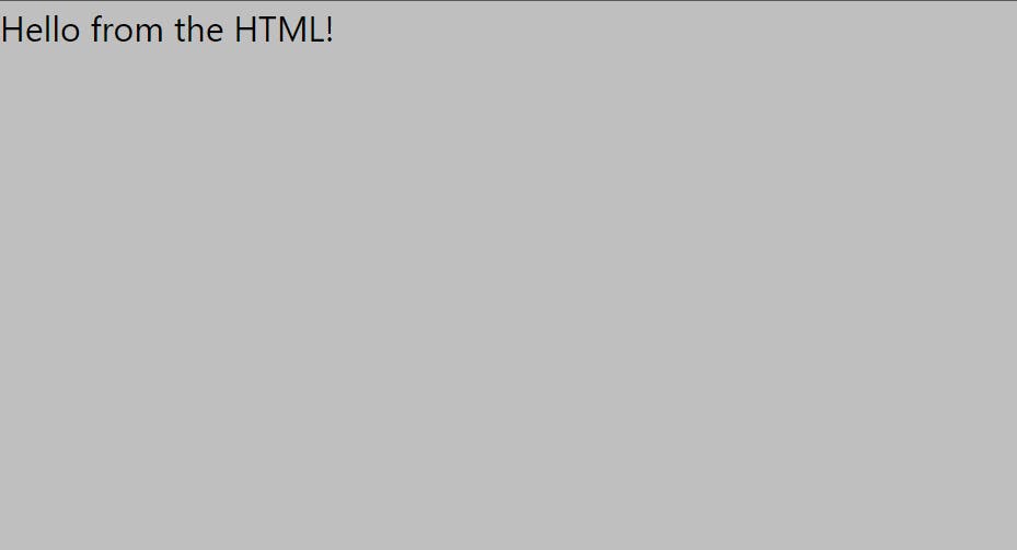
What we're doing here is telling TailwindCSS to give our div our custom background color (light-theme-gray) and make the height and width of our div fit the entire viewport (h-screen and w-screen). You should now see the text with a gray background:

Great! This is the background color we'll be using throughout this Tidbit, so this is good progress.
Step 2 - More and More Customization
Now, let's add the rest of our customization. We'll be adding custom properties for borderRadius, boxShadow, height, and width, so declare those as follows:
//tailwind.config.js
...
theme: {
   extend: {
      colors: {
        ...
     },
     borderRadius: {},
     boxShadow: {},
     height: {},
     width: {}
   }
}
....
And then add the following properties:
//tailwind.config.js
...
borderRadius: {
    card: "10px"
},
boxShadow: {
    "light-card":
        "12px 12px 16px 0 rgba(255, 255, 255, 0.3), -8px -8px 12px 0 rgba(0, 0, 0, .25)",
    "light-button":
        "6px 6px 8px 0 rgba(255, 255, 255, 0.3), -4px -4px 6px 0 rgba(0, 0, 0, .25)"
},
height: {
    card: "300px",
    button: "40px"
},
width: {
    card: "250px",
    button: "100px"
}
...
Also, add the rest of the colors we need:
//tailwind.config.js
...
colors: {
    "light-theme-gray": "#bfbfbf",
    "light-button-gray": "#bfbfbf",
    "light-font": "#474747"
},
...
Note: The box-shadows used here are from the CodePen that I linked in the introduction. They're not special in any specific way, they just work well for the neumorphic look. Mess around with them a bit and see how it looks!
At this point, this should be your full tailwind.config.js:
//tailwind.config.js
module.exports = {
  purge:[],
  theme: {
    extend: {
      colors: {
        "light-theme-gray": "#bfbfbf",
        "light-button-gray": "#bfbfbf",
        "light-font": "#474747"
      },
      borderRadius: {
        card: "10px"
      },
      boxShadow: {
        "light-card":
          "12px 12px 16px 0 rgba(255, 255, 255, 0.3), -8px -8px 12px 0 rgba(0, 0, 0, .25)",
        "light-button":
          "6px 6px 8px 0 rgba(255, 255, 255, 0.3), -4px -4px 6px 0 rgba(0, 0, 0, .25)"
      },
      height: {
        card: "300px",
        button: "40px"
      },
      width: {
        card: "250px",
        button: "100px"
      }
    }
  },
  variants: {},
  plugins: []
};
Note: Don't forget to run
yarn buildafter we edit this file!
Step 3 - Adding the HTML
Now, in this section, I'm going to throw a lot of HTML and a lot of Tailwind at you very quickly. Most of it will be pretty standard, and can be quickly found in the documentation. Instead of walking through every step of the HTML, I'm going to show you the (almost) finished file, and highlight the specific Tailwind that I think is important for learning here.
So, without further delay, here is the (almost) finished HTML:
<!DOCTYPE html>
<html lang="en">
  <head>
    <meta charset="UTF-8" />
    <meta name="viewport" content="width=device-width, initial-scale=1.0" />
    <meta http-equiv="X-UA-Compatible" content="ie=edge" />
    <link rel="stylesheet" href="/build/index.css" />
    <title>Document</title>
  </head>
  <body>
    <div
      class="bg-light-theme-gray h-screen w-screen flex items-center justify-center"
    >
      <div class="h-card w-card shadow-light-card rounded-card">
        <div class="flex flex-col items-center">
          <img
            src="http://placedog.net/75/75"
            class="rounded-full m-x-auto mt-10 shadow-light-button"
            id="profilePhoto"
          />

          <span class="mt-6 font-bold text-lg text-light-font">Doggo</span>
          <span class="font-light text-sm text-light-font"
            >Frontend Engineer</span
          >

          <div class="mt-6 inline-block items-center">
            <button
              class="rounded-full h-button w-button m-2 shadow-light-button text-light-font font-extrabold text-sm"
            >
              Message
            </button>
            <button
              class="rounded-full h-button w-button m-2 shadow-light-button text-light-font font-extrabold text-sm"
            >
              Follow
            </button>
          </div>
        </div>
      </div>
    </div>
  </body>
</html>
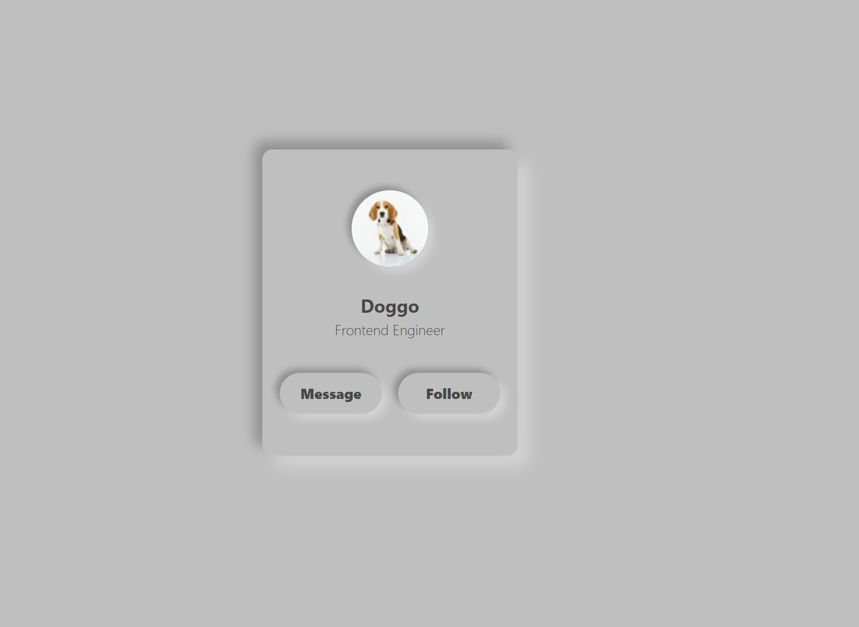
Once you save, you should now see this in your browser:

Before we make our final additions, let's highlight some key elements. First, note the places where our custom properties are used:
line 14: h-card w-card rounded-card
line 18: shadow-light-button
lines 22/23: text-light-font
lines 29/34: h-button w-button shadow-light-button text-light-font
Adding custom properties was quick and easy, and gave us descriptive classes for our card.
Other than the custom classes, some of my favorite Tailwind classes that we used here are m-x-auto, rounded-full, and flex flex-row.
m-x-auto: Applies auto margin to the x-axis of the element (so the left and right sides)
rounded-full: Gives us the fully-rounded look (pretty self explanatory, I just like it)
flex flex-col: Technically this is two classes, but they work in tandem. flex declares the element to be a flex container, and flex-col quickly makes it into a column instead of the default row.
Step 4 - Pseudo-Classes
At this point, we should be pretty happy with the look we've created. Not only have we taken a pretty unique design and made it a reality with Tailwind, but we've learned how to customize Tailwind along the way! However, if you click on the buttons, you'll quickly realize that something is missing. That something is, well, anything. The buttons don't move, and certainly don't emulate the style present in the CodePen. Never fear! There is a quick fix for this, and some more learning to be had along the way.
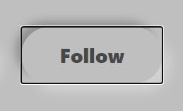
First on our list is focus. We need this pseudo-class to remove the outline that appears around the buttons when you click them:

To do this, go to the class attributes of our buttons and add focus:outline-none. Then, click the buttons and you'll no longer see the outline!
Next, we need to remove the box-shadow on the buttons when they're pressed, which requires that we use the active pseudo-class. Go back to the buttons and add active:shadow-none. Click the buttons again and...
Nothing?
This is weird, right? active is clearly listed as an available pseudo-class in the docs. So what gives? Well, Tailwind provides us with a lot of functionality in the default build (which we got by running yarn build earlier). However, the active pseudo-class is not included in this default build, so we therefore have to include specify it as an available variant in our tailwind.config.js file. In that file, you'll notice a variants object. Add an entry for boxShadow like so:
//tailwind.config.js
...
variants: {
    boxShadow: ['active']
}
...
This tells Tailwind that we want to include the active pseudo-class for boxShadow only. If we try to use active on other classes, it won't work unless we specify it in the same way here. Re-run yarn build and refresh your browser. When you click the buttons, the box-shadow now disappears and makes it look like the buttons are flush with the card!
Step 5 - Transitions
The design is done at this point, but we can do one more thing to spice it up a bit. Go back to your buttons one last time, and add the following to your class:
transition-shadow ease-in-out duration-100
Your (finally) finished HTML should look like this:
<!DOCTYPE html>
<html lang="en">
  <head>
    <meta charset="UTF-8" />
    <meta name="viewport" content="width=device-width, initial-scale=1.0" />
    <meta http-equiv="X-UA-Compatible" content="ie=edge" />
    <link rel="stylesheet" href="/build/index.css" />
    <title>Document</title>
  </head>
  <body>
    <div
      class="bg-light-theme-gray h-screen w-screen flex items-center justify-center"
    >
      <div class="h-card w-card shadow-light-card rounded-card">
        <div class="flex flex-col items-center">
          <img
            src="http://placedog.net/75/75"
            class="rounded-full m-x-auto mt-10 shadow-light-button"
            id="profilePhoto"
          />

          <span class="mt-6 font-bold text-lg text-light-font">Doggo</span>
          <span class="font-light text-sm text-light-font"
            >Frontend Engineer</span
          >

          <div class="mt-6 inline-block items-center">
            <button
              class="rounded-full h-button w-button m-2 shadow-light-button text-light-font font-extrabold text-sm focus:outline-none active:shadow-none transition-shadow ease-in-out duration-100"
            >
              Message
            </button>
            <button
              class="rounded-full h-button w-button m-2 shadow-light-button text-light-font font-extrabold text-sm focus:outline-none active:shadow-none transition-shadow ease-in-out duration-100"
            >
              Follow
            </button>
          </div>
        </div>
      </div>
    </div>
  </body>
</html>
All we've done in this step is add a transition for box-shadow, set the duration to 100 milliseconds, and specified the animation (ease-in-out). It's an easy addition, but makes a huge different for the feel of the card!
Conclusion
In this guide, we created a unique design from scratch, learned how to set up custom properties in TailwindCSS, and even learned how to add in non-default pseudo-classes. It's incredible how building one simple profile card can teach us so much, isn't it? You can view the completed code on the neumorphic_card branch of my tailwind-beginner-blog repo, at this link: github.com/sRobDev/tailwind-beginner-blog/t..
Thank you for reading, and be sure to give me a follow so you never miss out on a Tailwind Tidbit!
